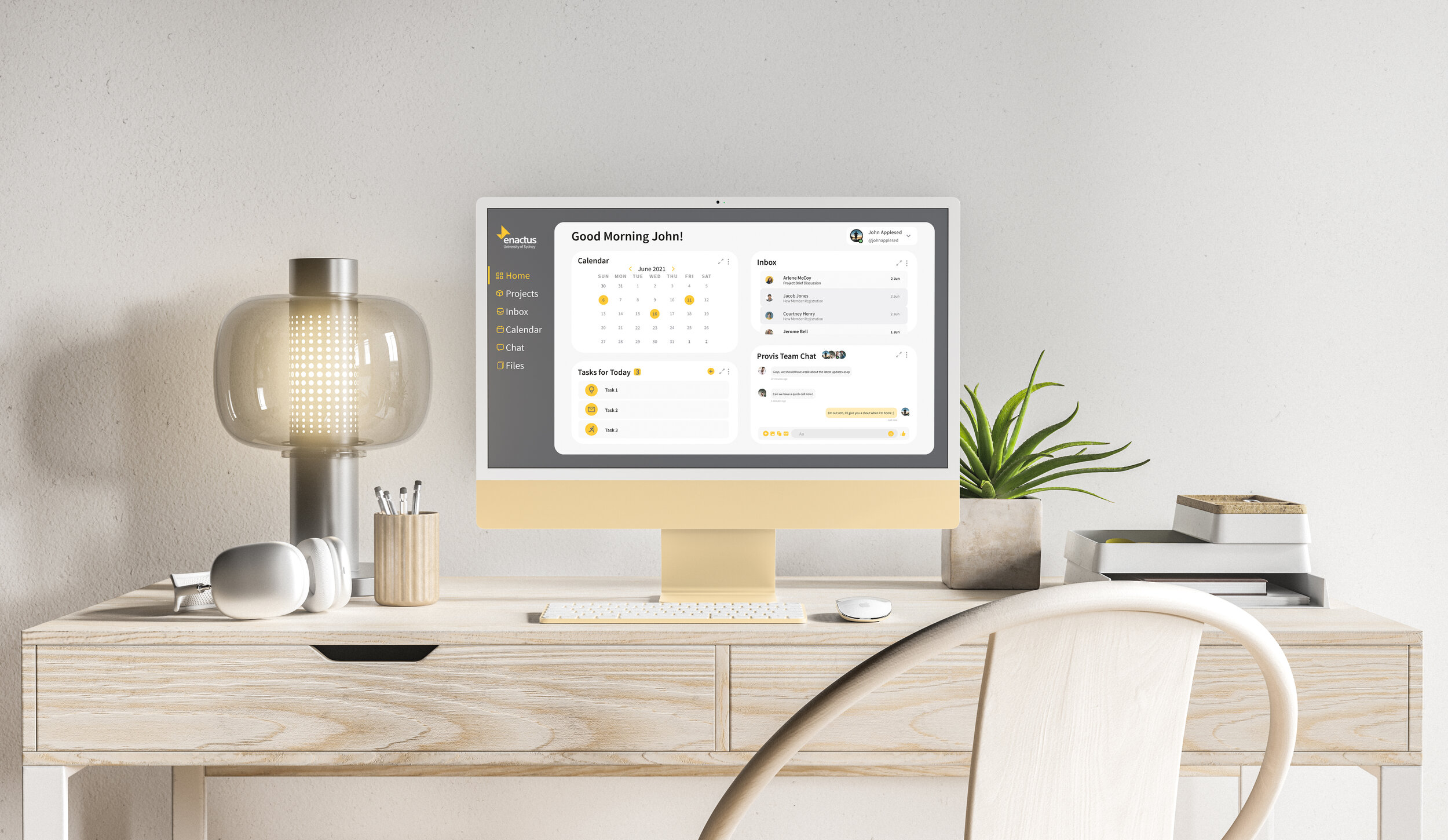
A centralised internal team dashboard with access to all required information and communication for current members to ensure the experience of running a project is effortless. An intuitive calendar system with access to important event information. A dedicated place to submit questions and enquiries to the Enactus team. The redesign of the Enactus Sydney website is more user friendly, detailed and functional and better achieves the organisation’s mission and vision.
Enactus Sydney
Class: IDEA9105 INTERFACE DESIGN
Dates: march to JUNE 2021 (12 weeks)
LOCATION: The University of Sydney, sydney
MY Role: User Research / USER INTERFACE DESIGNER FOR DESKTOP WEBSITE
MY Team: daniel chan, Aditya Srivastava, SKY XIE
my Tutor: james anderson
TOOLS USED: miro, balsamiq, figma, adobe photoshop
Project Background
About Enactus
Enactus is a global non-profit organisation that runs on 1730 campuses internationally (Enactus.org, 2021). Our client, Enactus Sydney, is doing its part in using entrepreneurial action to create sustainable social businesses that empower and enrich the lives of our community’s most disadvantaged by running projects and holding events.
Enactus’ vision: to innovate, connect and create shared value, transforming societal needs into opportunities that empower and enrich the lives of our community’s most disadvantaged
Design Brief
Currently, the Enactus Sydney website displays basic information about how the society works - the projects they currently operate and a bit about the executive team, making it “effectively useless” for the 50+ team members who require numerous other tools including:
A calendar of all Enactus Sydney events throughout the semester
Links to important administrative documents that must be accessed by project members
A dedicated space to submit anonymous suggestions, questions and complaints to the executive team
The client has commissioned our team to improve the current website (desktop, tablet and mobile) to better achieve its mission and vision, and make it more user friendly, detailed and functional, ensuring the experience of running a project is as easy as possible.
Note: In this portfolio piece I will be mainly focusing on my personal contributions to the project - iterations of the desktop version of the redesign.
Design Process
DISCOVER
To get a greater understanding of our problem space, we conducted initial primary research into the Enactus Sydney website and their functions to find out areas of improvement that we needed to address. We were able to achieve this by having a conversation with the President of Enactus Sydney, who gave us rich insights into the organisation’s goals, needs and issues. This helped us form the basis of our subsequent design approach.
Following this, we conducted online ethnography on Enactus Sydney’s Instagram account to list out important themes and areas of improvement that we wanted to focus on. We also conducted competitor analysis to have a look at other societies who are working in the similar way as Enactus Sydney and draw inspiration and see what areas of improvement could be made to Enactus Sydney’s website. Jobs to be done helped us realise the most important specific features on the current setup of the Enactus Sydney website.
DEFINE
After the research phase, my group and I analysed all of the data and created a list of user needs and worked out who our target audience was.
Primary users: members of Enactus Sydney who are going to use the website for various purposes like collaborating with each other on a common platform, updating website with the latest Enactus content and events, engaging new members and attracting more people to join the society.
Apart from our primary users, we also have New Members and Non-Members of Enactus who are going to use the website to learn what Enactus is about, what projects are currently being worked on, want to join the society, and attend events and workshops hosted by Enactus.
DEVELOP
After conducting our research and uncovering user values, goals, needs and issues, we brainstormed and started iterating probable solutions for our design. First, we made rough hand sketches for each platform and critiqued them within our team to improve them with every iteration. We focused on keeping a minimal look for the website with high functionality and features which catered to the user needs.
Idea generation and initial sketches
Following these initial sketches, we worked on developing our individual project parts - I continued to work on the desktop sketches.
Initial desktop sketches of the main screens of the website
I made some iterations following the first lot of hand-sketches wireframes as seen above:
2. Sign In Modal
Added functionality to original Sign In Modal:
“Sign Up” option for new members to sign up
A checkbox for users to “stay signed in”
“forgot password” option in case members forget their password
3. Member Dashboard
Added accessibility option for users to toggle on/off dark mode
4. Contact Page
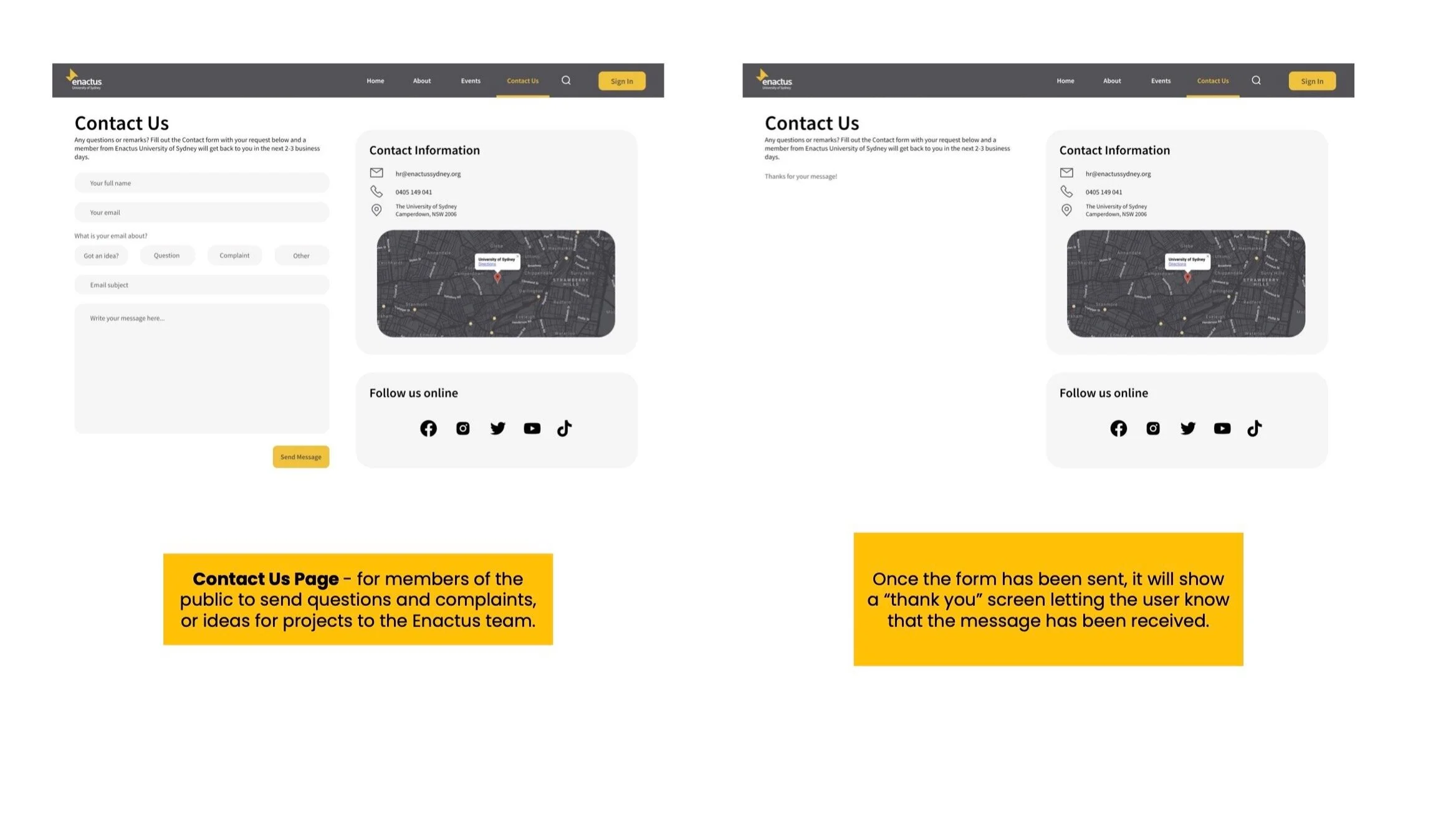
Added more details on contact screen on the right hand side so viewers to the website can see their email, phone and address in one place
Following hand-sketches and some iterations for certain parts, low-fi digital wireframes were created on Balsamiq.
The low-fi digital wireframes below show:
How the home screen would to members and non-members
When the ‘Sign In’ button is clicked on the top right hand side of the screen, a “Sign In/Sign Up” modal pops up in the middle of the screen, allowing people to sign in or sign up
The contact page allows people to contact the Enactus executive team, and it also displays other details such as their phone number and address
Iterations followed for these low-fi digital wireframes - I added two features to the Dashboard to make it even more customisable and simple for members.
I created a desktop wireflow for the low-fi digital wireframes to show how all the wireframes are linked.
Further client meetings informed us that the Enactus team members typically collaborate and communicate through Facebook Messenger and Google Drive. Keeping that in mind, we changed our initial idea of having an independent file system and login details, and integrated the ability for the user to login to the dashboard using their social media accounts (Facebook and Google) instead of making them create a new messages and files account.
Moreover, internally my team and I conducted a heuristic evaluation to inform how well each of Nielsen’s Ten Heuristic Principles was satisfied and made changes accordingly to ensure all heuristics was visible in the prototype before we progressed to higher-fi digital interactive mockups.
Higher-fi digital interactive mockups were made using Figma and were tested with seven participants through think alouds and interviews. We also internally tested the accessibility of our user interface to ensure the colours and contrast adhered to the WCAG guidelines.
Final Solution
Please view my final desktop interactive digital prototype on Figma here:
Note: Please hover over the top right hand corner of the screen and select “Fit - scale down to fit” under the option dropdown tab to view the prototype correctly.


